
The Process Files : The House at Gatewood
Designing a logo that will withstand the test of time is always the goal when going into an identity project. My approach to pursuing this often includes a deep-dive into the folklore and origin stories surrounding the particular subject I’m researching because it’s always good to know where we’ve been in order to know where we’re going. Utilizing entrenched perceptions within local rural and urban story traditions unearths the connection in time. As much as this helps inform a general direction for the process, the most important thing is to get a good sense of your story and seeing what patterns emerge to lay out the foundations of the brand’s identity.

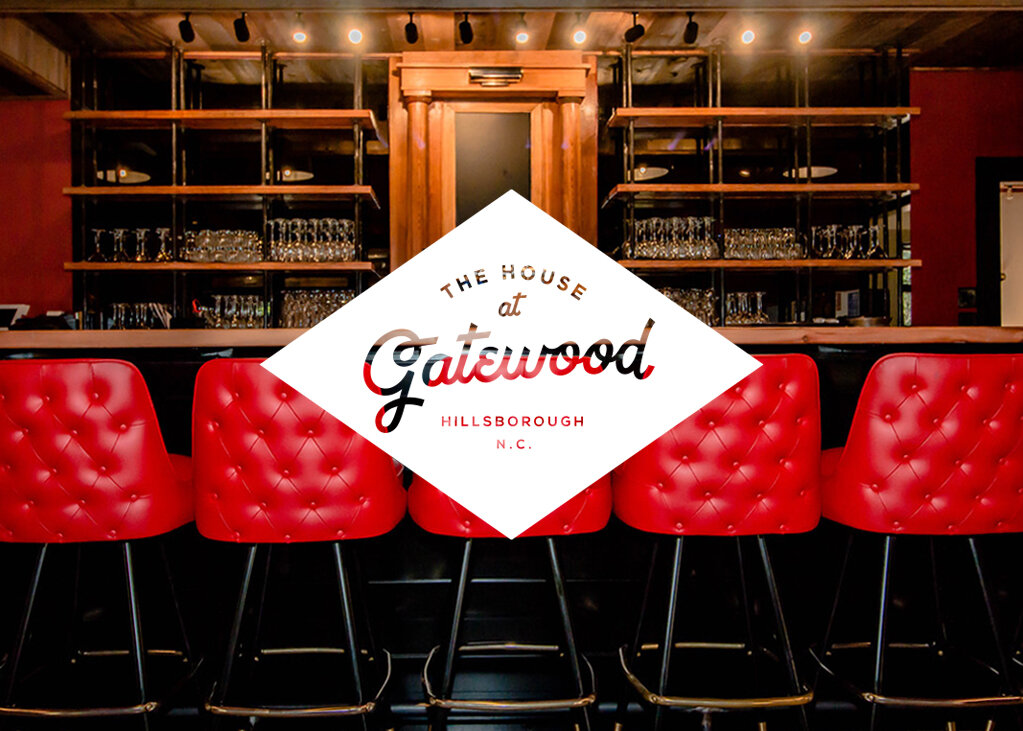
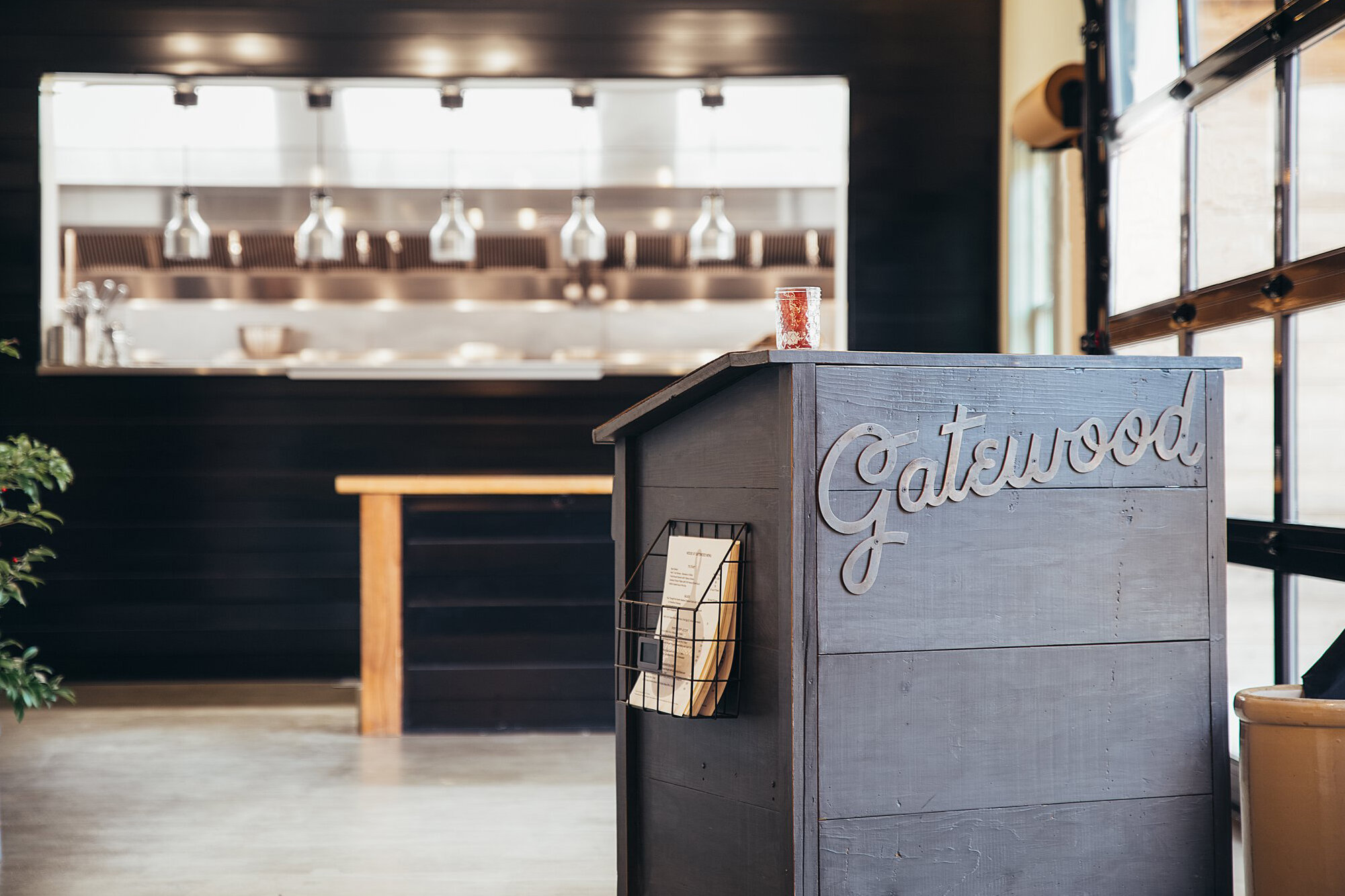
With the logo here for the House at Gatewood, most of my process was spent working with the Carrie Moore Interior Design team who were designing all of the amazing renovations of the house. An old colonial revival originally built in the 1940′s, this house-turned-restaurant located in Hillsboro, N.C. gets its name from a former owner of the estate, a local dentist named Dr. Joseph Gatewood. Overall, the direction I was given was mainly centered around the country modern decor going into the restaurant. This, along with southern folk traditions of the home, make you feel a welcomed part of the family. The 16-acre grounds of the estate include three houses and beautiful landscaping that features a large pond and outdoor seating underneath a canopy of massive magnolia trees, making it the perfect setting for wedding events or any other special occasion. This calls for a hint of elegance in our logo while still staying within the realm of a place that the whole family could enjoy. With there being different rooms broken up into different sections of the restaurant, you really do get a sense that there’s a place for everybody here. As a way to keep things classy but still down-to-home, we decided that a hand-lettered script would be the best way to convey this spirit and setting. Script lettering can be one of the most challenging styles to pull off as it can take some time to develop as work through different styles and forms to get every curve and detail just right to appeal to everyone’s sensibilities. It can give a new brand an instant-classic look when done well, and will represent for many years to come.

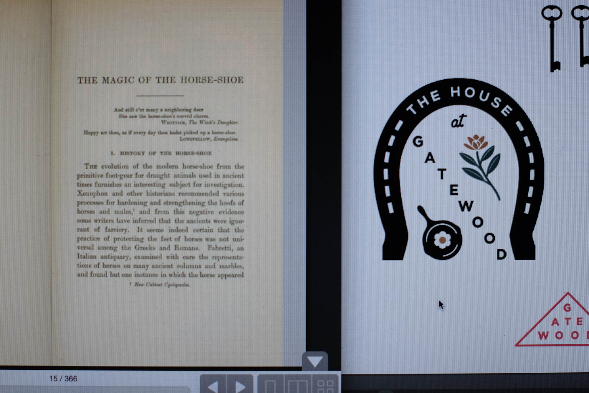
Since they’re using cast iron skillets to do a lot of the cooking, it was important to find a way to incorporate that element in the brand family. In my research starting the process, I came across a book called The Magic of the Horse-Shoe by Robert Means Lawrence. This inquiry studies the origins of popular customs and beliefs including the folklore of iron as it relates to the horse-shoe as a symbol for good luck and protection for the home and the properties of cast iron in cooking and the folklore of salt. With these all being such great pieces that symbolize both the home (and the kitchen especially), I felt like this was the best direction to focus on and develop into a series of elements that complement the main script logo and help tell a deeper narrative for the brand through menus and other supporting materials. There were also talks about including a horseshoe pit on the property and having the ability to host tournaments at the restaurant, so it seemed like this could be a perfect symbol to include as another iron element and possibly making their own set of branded horseshoes that could also be sold as merch. For other supporting iron elements, I also included a pair of skeleton keys for the house and a “GW” branding iron monogram that could speak to the particular beer-fed beef cattle source that was a celebrated offering of the chef.

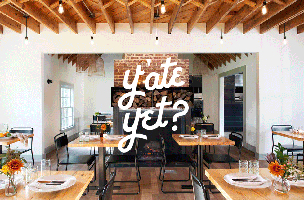
With the magnolia tree being another focus, I wanted to explore how the blossoms might look as an embroidery on cloth napkins that you might use for a special event like a wedding or engagement party. Owner Chef Ron Spada had also talked about having a special flag on display to honor our veterans, so I had included an element in my presentation to represent a folded flag with magnolia flowers in place of the stars to imagine what a custom-made flag could be. But the real power of invitation here in the offering is the tagline. This short and effective, charming and inviting query asks the guest to think about eating! I came up with a tagline “Y’ate yet?” as a play on the southern way of saying “Jeet yet?” as a shortened form of “Did you eat yet?”, and while “Y’ate” uses the same style lettering that borrows from the main logo for Gatewood, it’s also a bit like “y’all”, which just ties it all in to the quintessential southern phrase. In the meetings I had with Chef Ron, I got a real sense that the ability to tell a deeper story and educating the community through the food was of the utmost importance to him, so the biggest thing I wanted to show was how versatile each element can be to support this visually.
Observations on The Journey and the Coming Together of Vision and Expectation
Typically, when designing for a brand like this, I’m considering how the logo can be supported by a whole family of symbolic icons that can help my clients tell their stories in the most compelling way, and it’s best to share your vision of what it can be. However, a presentation board like I have here can be pretty overwhelming to take in all at once when you’re just trying to decide on one main logo. It’s hard to really point to what’s what when you’re just communicating through email and someone else is trying to speak for you and where the vision is going. No one else can really speak for your thought process but you, and as I’ve had time to reflect on this process over many, many years of creative process, it’s more clear to me how important it is for me to have that one-on-one exchange (either in person or on a video call) when presenting design directions because the best connections always happen in real-time when you’re bouncing ideas off each other in the moment, getting better clarity on feedback and not leaving too much to interpretation through email. Real conversations are key. It’s now a year later, and I can see they’ve been getting some good use out of where we ended up for the final logo. With the amount of work that goes into a project like this, you always hope to make a statement that will last for a long time. Here’s to a great journey with great people and a great outcome!
Check ‘em out at https://www.houseatgatewood.com/